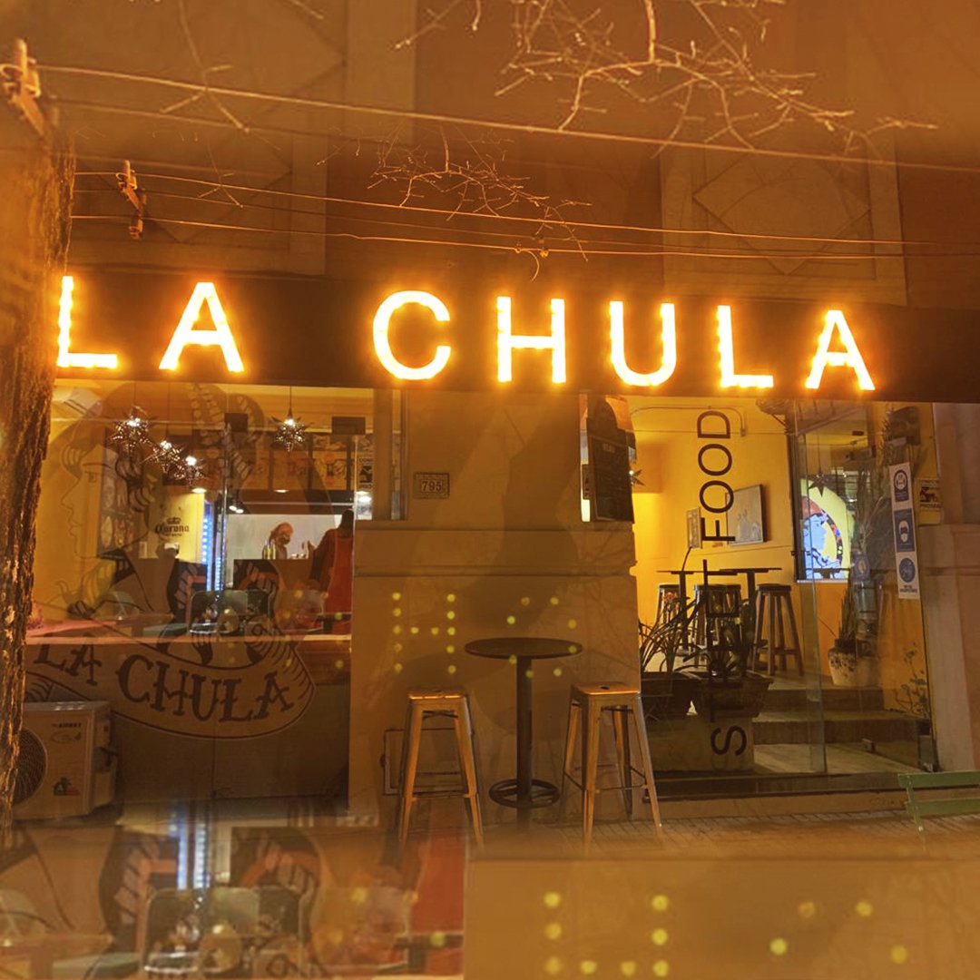
LA CHULA
About the Client
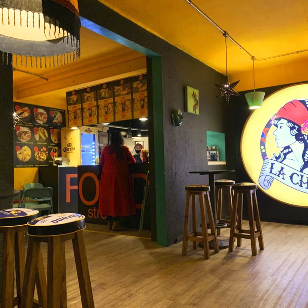
La Chula is a Mexican restaurant with a Spanish touch, based on fast food menus but with quality products of Mexican origin. The company has 2 restaurants in Montevideo, Uruguay.
Briefing
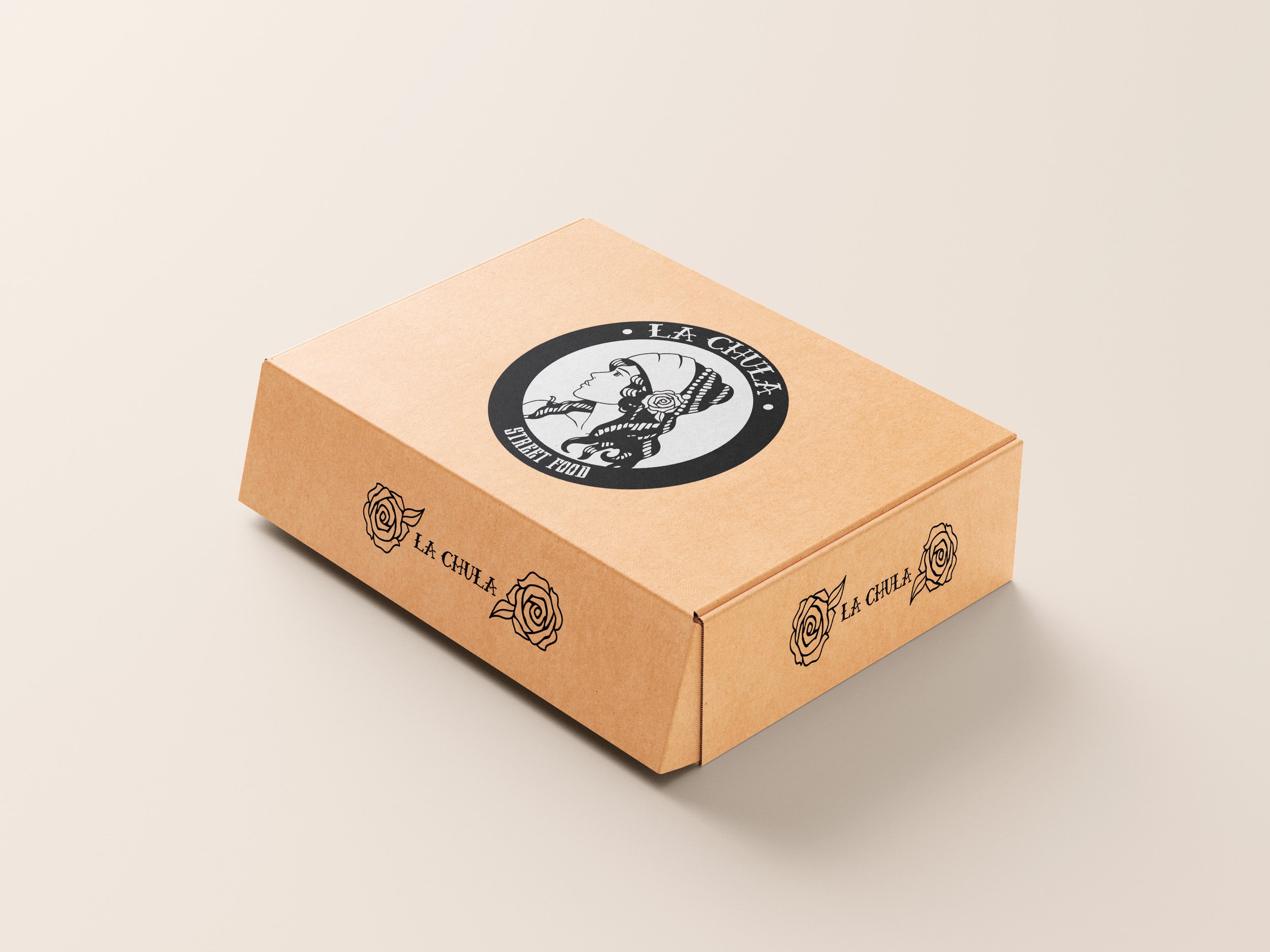
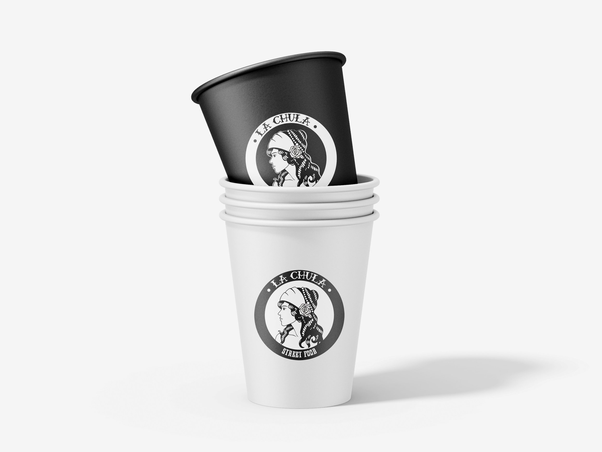
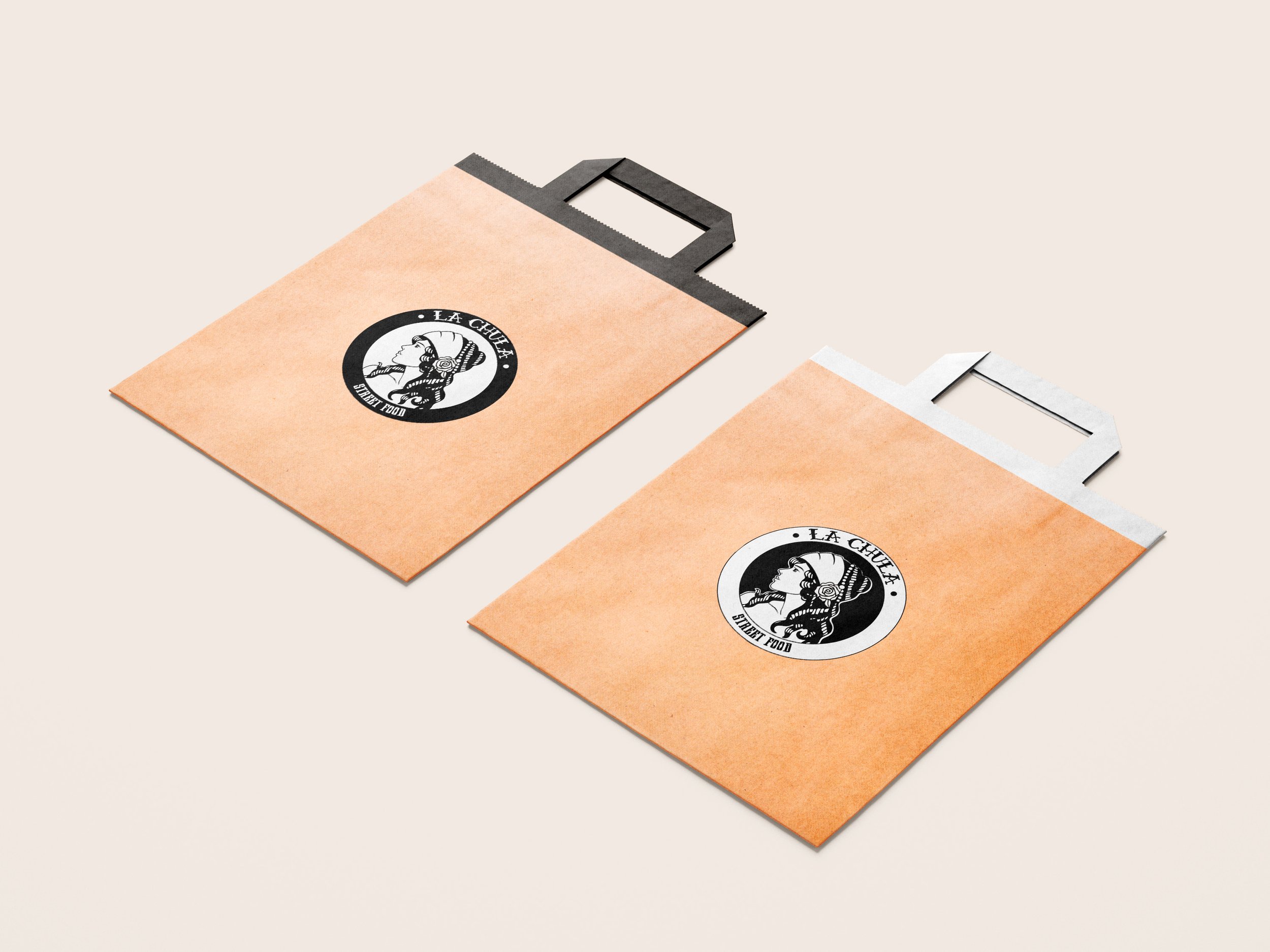
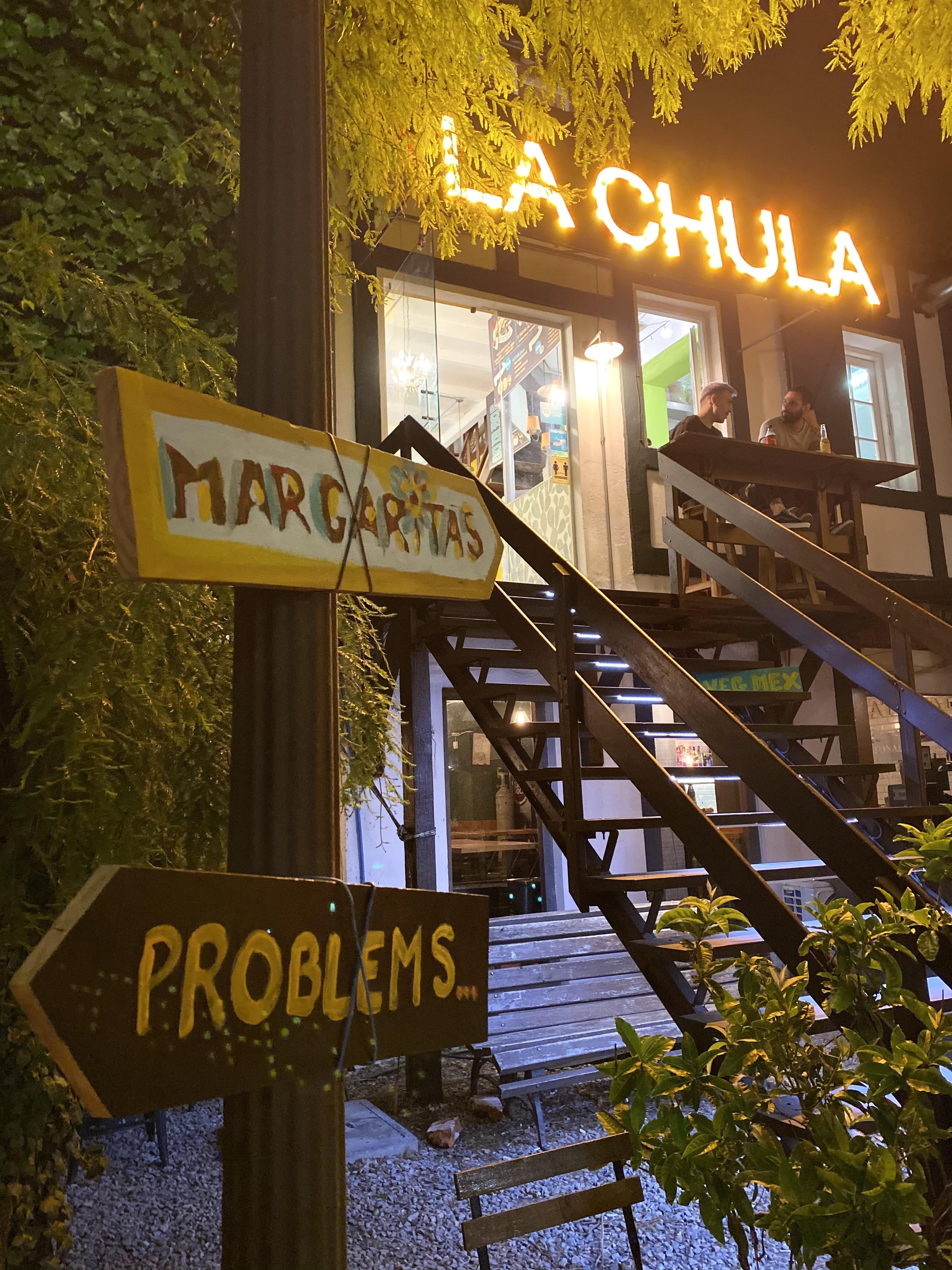
Before the opening of the restaurant, we made the initial brand design that will be developed in multiple formats for both print and social networks, Focusing primarily on the packaging for its different types of combos and products. And once opened, manage the restaurant's media as a community manager.
BRAND TONES
Authentic
Friendly
Savory
Abundant
Fiesta
Logo Design
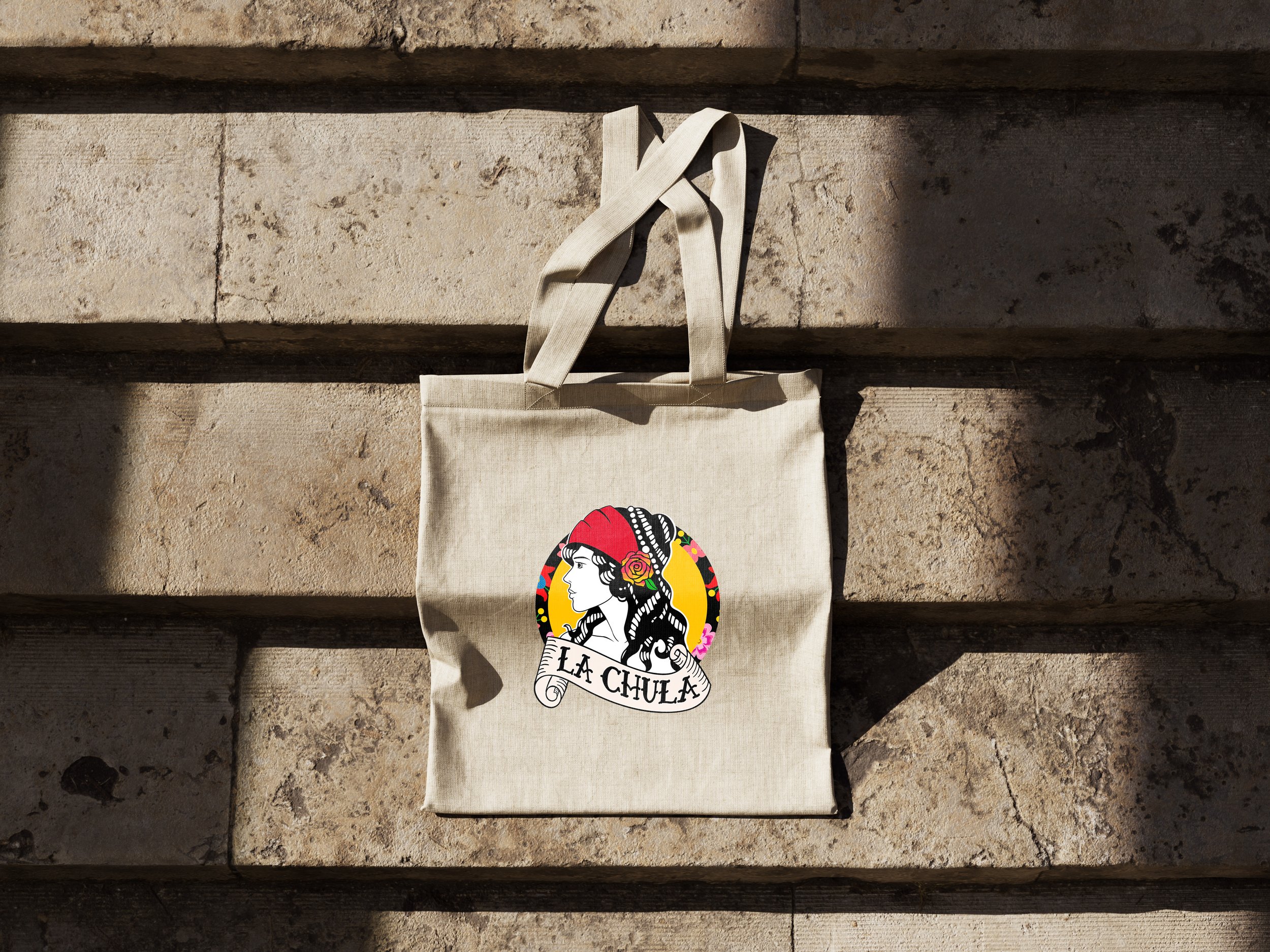
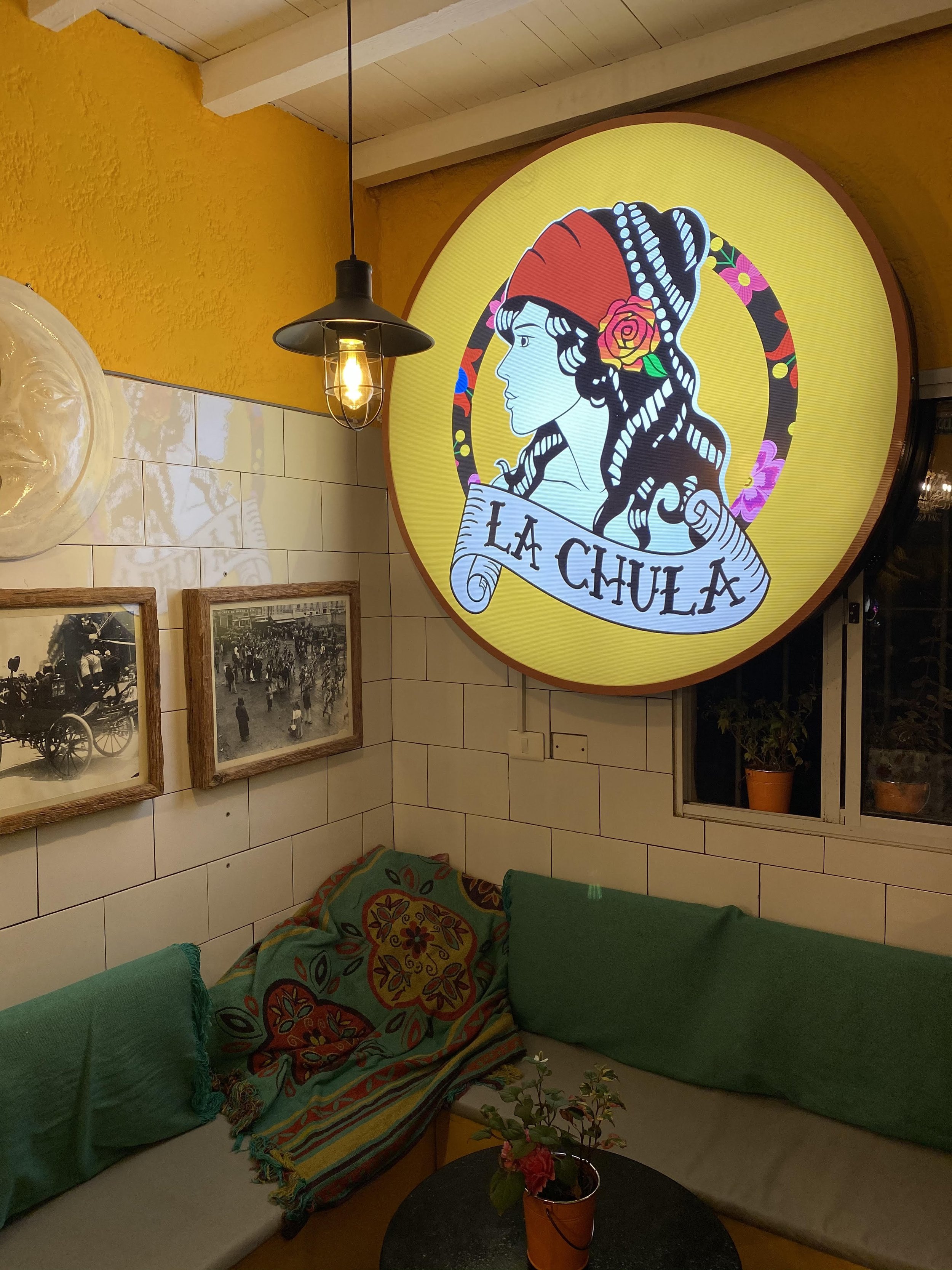
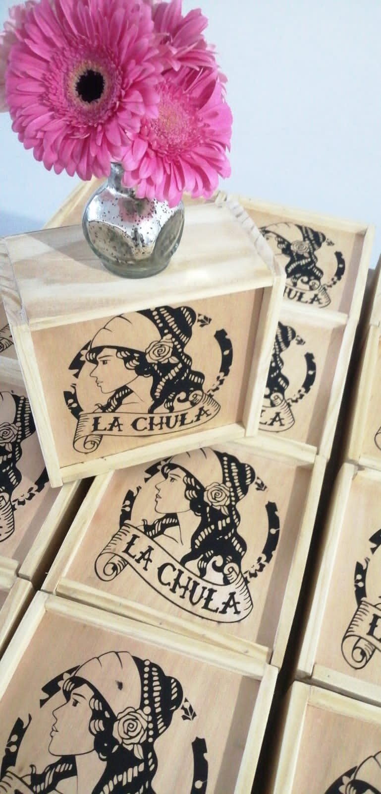
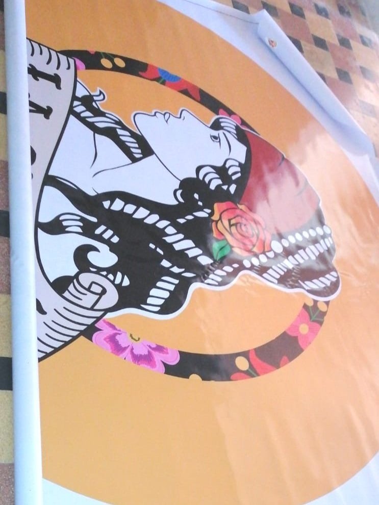
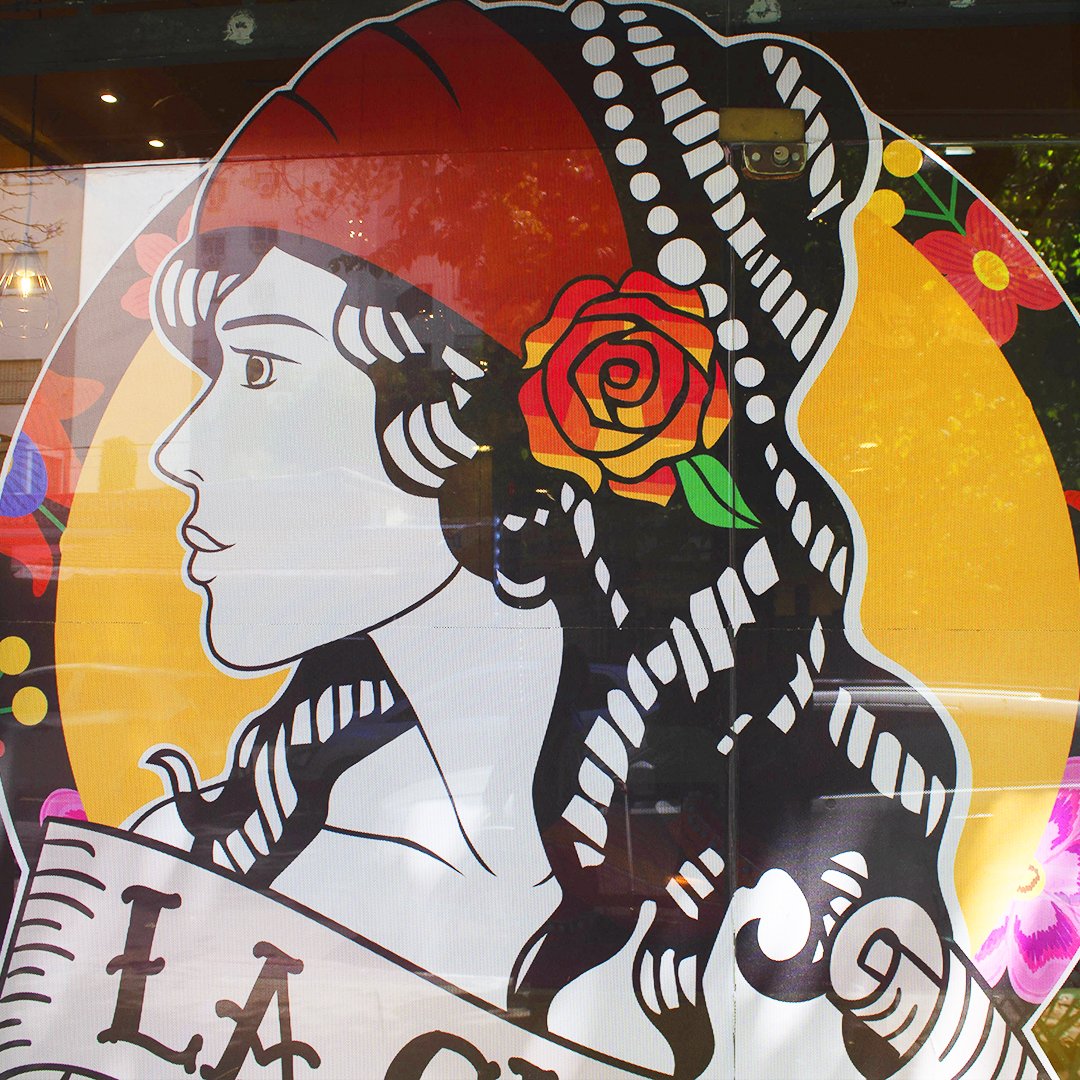
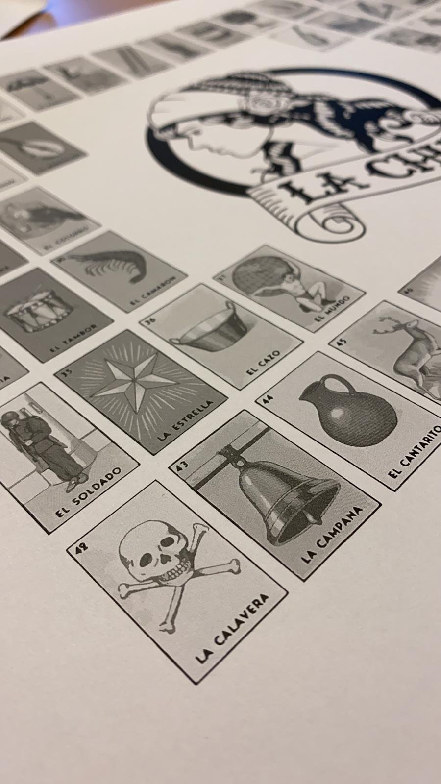
The logo had to be very colorful and very authentic since that is what Mexico transmits and to call the attention at first sight of the client. The old school style of the drawing represents the traditional and the name La Chula means the cool girl, therefore the representation of the woman has to be very present.


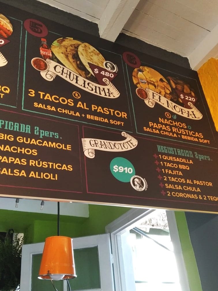
To further accentuate the colors in the menu and social media, we expanded the range of the palette leaving the primary color yellow and adding 2 more colors, which match perfectly with the logo, making the design more fun and youthful.