HOUSE HUNTING INTERNATIONAL

About the Client
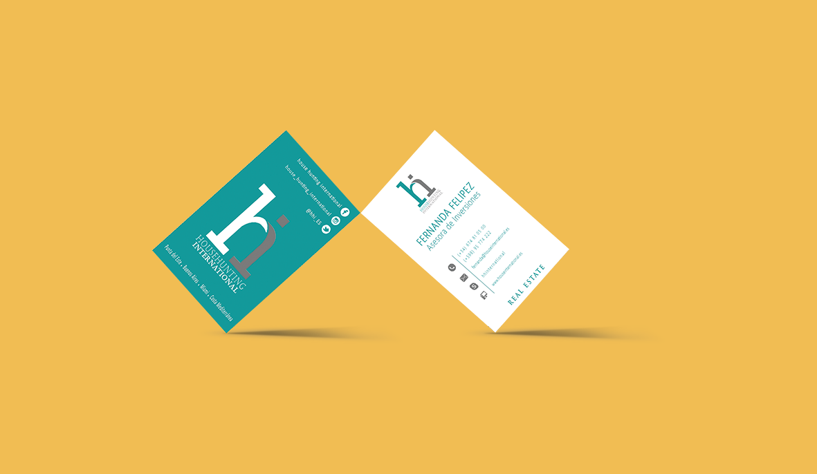
House Hunting International is a company dedicated to the real estate sector, advising clients on investing abroad. Its main cities of business are Punta del Este, Buenos Aires, Miami, and Valencia, traveling from one place to another in search of new interesting housing investment projects.
Briefing
The main project was to create the brand and adapt it to print media and social networks.
BRAND TONES
Professional
Reliable
Transparent
Multicultural
Logo Design
The shape of the logo design is composed of the letter H (House Hunting) and I (International). Making the two merge, referring to the union between countries. The choice of the primary color, a mixture of green and blue, is a way to represent the water that unites the different continents, representing the multiculturalism of the company.